GitLab Clears UI Clutter for Smarter Duo Interactions
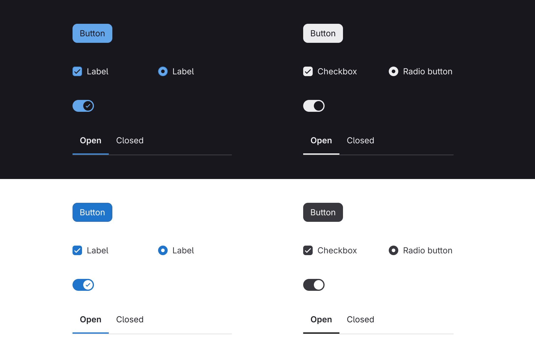
💡See how GitLab is redesigning its UI to make GitLab Duo interactions surface at the right moment.
⚡ 30-Second TL;DR
What Changed
Buttons, form controls, toggles, and tabs now use more neutral styling with increased contrast.
Why It Matters
AI practitioners using GitLab may see less visual competition around GitLab Duo features and clearer prompts for required actions. However, teams should validate accessibility and discoverability because reduced color and neutral controls can make states harder to distinguish.
What To Do Next
Test GitLab Duo workflows in your current instance and report any contrast, state-recognition, or prompt-discoverability issues through GitLab’s UI feedback issue.
Key Points
- •Buttons, form controls, toggles, and tabs now use more neutral styling with increased contrast.
- •Instance theming covers more interface surfaces, supported by an updated neutral palette and tinted neutrals.
- •A bloom-style glow highlights GitLab Duo interactions and moments that require user input.
- •GitLab says the quieter UI is intended to support intelligent features that surface actions contextually.
Weekly AI Recap
Read this week's curated digest of top AI events →
👉Related Updates
AI-curated news aggregator. All content rights belong to original publishers.
Original source: GitLab Blog ↗
This is a summary, not the original. Read the source, or get the weekly briefing.
Weekly AI briefing
One email a week. Unsubscribe anytime.