🇨🇳cnBeta (Full RSS)•Recentcollected in 8h
iOS 27 Redesigns App Icons with Sharper Liquid Glass
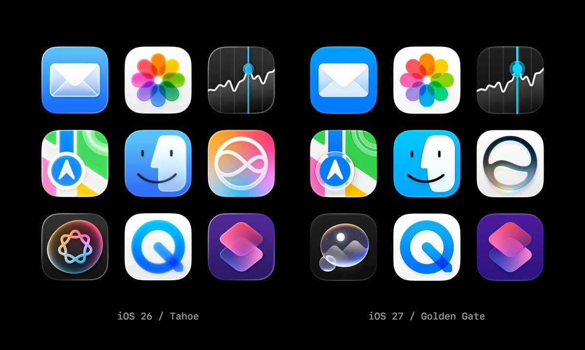
💡Understand Apple's evolving design language to keep your app's UI/UX competitive and visually aligned with iOS 27.
⚡ 30-Second TL;DR
What Changed
Transition from a single thick glass layer to multi-layered rendering
Why It Matters
This update signals Apple's continued commitment to high-fidelity UI design, potentially influencing future design system standards for mobile applications.
What To Do Next
Review your app's icon assets against the new iOS 27 design guidelines to ensure visual consistency with the system's updated aesthetic.
Who should care:Creators & Designers
📰
Weekly AI Recap
Read this week's curated digest of top AI events →
👉Related Updates
AI-curated news aggregator. All content rights belong to original publishers.
Original source: cnBeta (Full RSS) ↗